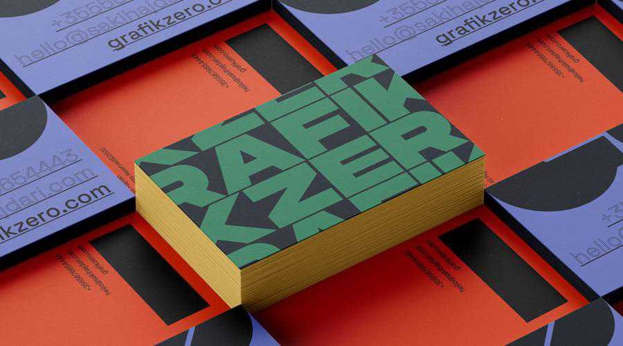
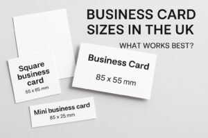
Business cards provide an easy way to exchange contact information quickly and efficiently so it is quite important for the card holders to put the most important information in the limited space of 85mm x 55mm.
There are a few things that should not be included on a business card.
First, avoid using overly fancy or elaborate fonts, as they can make the text difficult to read.
Second, avoid using too much information on the card, as this can make it cluttered and difficult to read.
Third, avoid using low-quality paper or printing, as this can make the card look unprofessional.
Fourth, avoid including unnecessary information, such as your personal hobbies or interests, on the card.
These things can distract from the important information and make the card less effective.


