Even in a digital-first world, printed posters remain a powerful marketing tool for businesses, events, product launches, and promotions. But here’s the catch—a poorly designed poster can be worse than none at all.
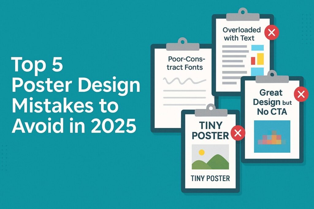
At DiscoverPrint, we’ve seen what works and what fails. To help you make a lasting impression and get the most from your poster printing, here are the top 5 poster design mistakes to avoid in 2025.
❌ 1. Overloading the Poster with Text
Why It’s a Mistake:
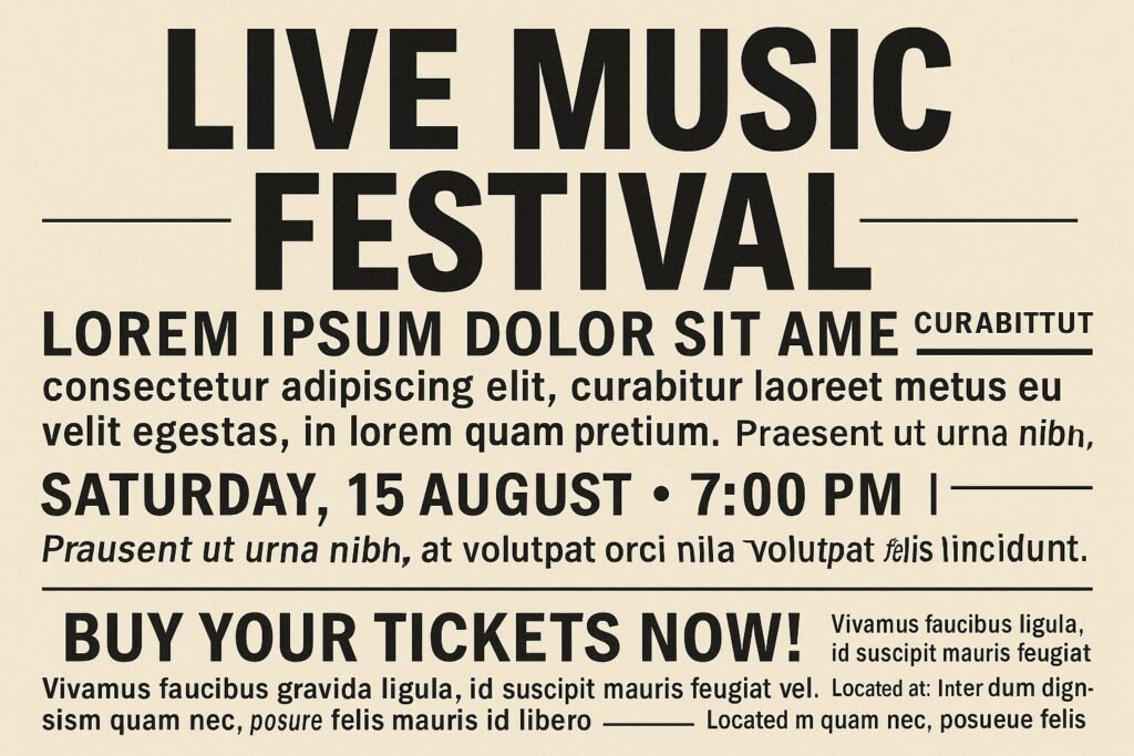
Posters are meant to grab attention quickly—too much text overwhelms the viewer and dilutes your message.
✅ Solution:
Use a clear, bold headline. Follow it with minimal supporting text and a clear call-to-action (CTA). Think of your poster as a visual billboard, not a brochure.
❌ 2. Poor Contrast & Illegible Fonts
Why It’s a Mistake:
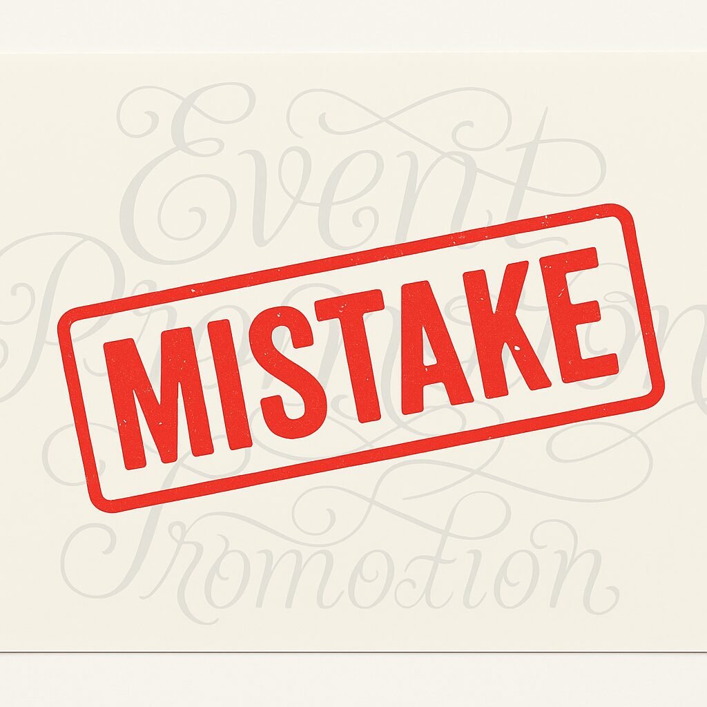
If people can’t read your poster from a distance, it’s not doing its job. Low contrast between background and text or using hard-to-read fonts makes your message ineffective.
✅ Solution:
Stick with high contrast colours (e.g. black on white, white on red) and legible fonts like Helvetica, Arial, or Roboto. Avoid script and novelty fonts unless for decorative headings.
❌ 3. Ignoring Poster Size and Viewing Distance

Why It’s a Mistake:
Designing for A4 when your poster will be displayed on a large wall or roadside will make it unreadable from a distance.
✅ Solution:
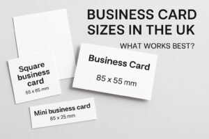
Choose the right poster size for your location—A1 and A0 for large spaces, A3 for smaller indoor use. Design with visibility in mind: larger fonts, fewer elements, and bolder colours.
📌 Need help choosing the right size?
🔗 Check our Poster Size Guide →
❌ 4. Missing or Weak Call-to-Action (CTA)

Why It’s a Mistake:
If your poster doesn’t tell viewers what to do next—visit your store, scan a QR code, attend an event—you’re losing leads.
✅ Solution:
Always include a strong and simple CTA, such as:
-
“Visit us today!”
-
“Call now for a free quote”
-
“Scan the QR code to learn more”
-
“Sale ends Friday—don’t miss it!”
❌ 5. Using Low-Resolution Images

Why It’s a Mistake:
Blurry, pixelated images make your brand look unprofessional and untrustworthy. When printed, low-res graphics can ruin even the best design.
✅ Solution:
Use images at 300 DPI or higher for print. If in doubt, let our team at DiscoverPrint review your file for free before printing.
🎯 Summary: Design Smart, Print Bold
| Mistake | Fix It With |
|---|---|
| Too much text | Short headlines + concise info |
| Poor contrast or font choice | Clear fonts + high contrast colours |
| Wrong size for location | Pick A0, A1, A2, or A3 based on use |
| No call-to-action | Tell viewers exactly what to do next |
| Low-resolution graphics | Use 300 DPI images or request a proof |
🛍️ Print Your Perfect Poster with DiscoverPrint
At DiscoverPrint, we offer:
-
A0, A1, A2, A3 poster printing
-
Gloss, matte, or silk finishes
-
Same-day turnaround available
-
Design support & pre-print checks
-
UK-wide delivery
🟢 Order Custom Posters Online Now →
📈 Final Thoughts
Avoiding these poster design mistakes can make the difference between a poster that gets ignored and one that generates leads, drives traffic, and makes your brand unforgettable.
Need help getting started?
📩 Contact our design team or explore our full range of printing services.
